 ackers are having a field day producing retractions of scientific papers
for alleged image manipulation. Highly regarded researchers in cancer,
Alzheimer's disease, and elsewhere are
having their findings retracted, much to the celebration of anti-science
activists. The editors of Nature magazine even went so far as to
suggest a
bounty hunt:
Sleuths should be compensated and given access to tools to improve the hunt for errors and fraud — not face ridicule, harassment and legal action. Publishers could create a cash pool to pay them, similar to the “bug bounties” that reward hackers who detect flaws in computer security systems... Retractions should not be career killers — those correcting honest errors should be celebrated.
The only way to do what the Nature editors want would be to eliminate all print journals (like, say, Nature) and allow versioning and updating of online articles. Until that glorious day arrives, we should take a hard look at the methods used to detect fraud. These methods appeal to hackers because they don't require scientific expertise. Editors like them because they generate an outpouring of outrage that generates clicks. But they are fatally flawed.
In this article I will show you why that is, using simulated examples of blots known to be good and taken on privately owned equipment. Before doing that, I have to describe some simple techniques used by so-called “Internet sleuths” and show what they can and cannot do.
Image forensics is highly technical and mathematical, yet even among professionals there are few methods that work reliably. A recent study found that with the common manipulation of copy-move + flip transformation, all professional image forensic software scored less than two percent accuracy.[1] The authors suggested that dedicated metrics, as well as better algorithms, are needed in this field.
Many of the methods in common use by amateur Internet sleuths also have both low accuracy and high false detection rates. It's easy to cherry-pick portions of images that look similar but are really not.
What is a Western blot
To study a disease, researchers typically study one protein at a time (out of the tens of thousands of proteins in a cell) using Western blots. They isolate the proteins from cells or patients and separate them according to size by electrophoresis. They then “blot” the proteins onto a thin membrane that resembles a small sheet of white paper. The blot is washed with antibodies that bind to a specific protein to make it visible, photographed with a scientific camera, and the bands are measured using a process called densitometry. The amount of protein is proportional to the size and strength of the band. A Western blot is easy to do but hard to get perfect. Unfortunately, if it's not perfect, it's very hard to get published. So, researchers may be tempted to make it perfect. The most common motivation seems to be not to deceive, but to get the project finished so they can publish more papers and advance their careers. However, doing so makes it impossible to know what really happened in the experiment.
Alternatives, such as capillary electrophoresis, robotics, and mass spectrometry, are far too expensive for academic labs, which typically prefer to use time-consuming manual labor by poorly paid students and postdocs using antiquated equipment. I've seen researchers using equipment that is marked ‘Made in West Germany’ and doing board-level repairs when it breaks.
Below is an example of a Western blot of a protein called actin that I stained with a chemiluminescent dye and imaged on personally owned equipment that I built in my home optics lab (formerly a bedroom). The image has been color-inverted to make the bands black, labeled, cropped, and converted to RGB color to accommodate browsers that can't handle 16-bit grayscale images.
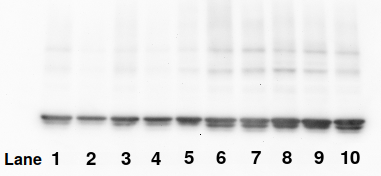
A known good—or at least unmanipulated—Western blot stained for actin. Actin is often used as a loading control, which means all the bands in this blot are supposed to look the same. This one would be unpublishable because the commercial antibody is showing two bands instead of one
Histogram method
Suppose we suspected that the bands in lanes 6 and 7, which appear similar, were actually copies of each other or manipulated in some way. One way of testing this is to make a histogram, which counts the number of pixels of each of the 65,536 gray levels, known as pixel values or pixel densities.
Many software packages such as Imal can put a histogram into a text file for graphing and data analysis. The method is easy:
Create small images of the two suspect bands, making them the same size, in this case 33×33 pixels.
Create a histogram on the two images.
Plot them in a graph.
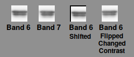
Sample bands produced by manipulation of bands 6 and 7 of the Western blot shown above
The histograms below show that a histogram can prove that bands 6 and 7, which appear similar, actually differ (panel A). A histogram isn't fooled if the image is flipped or warped (not shown), shifted (B), rotated, or copied. It can also detect if the miscreant both flips the band and changes its contrast (Panel C) once an appropriate x-axis scale is found (as shown on the top of the x-axis). The histogram easily proves that they are identical, though some calculation is needed to find the scale.
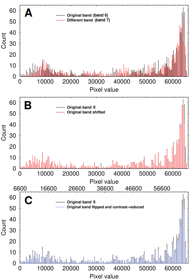
Histogram analysis of the sample bands shown above
The benefit of the histogram method is that it ignores the shape of the band and relies solely on the relationships between pixel values in the data, which is to say the actual meaningful content. However, it is less effective on images that have been reduced to 8 bits/channel, as is done in conventional RGB images and PDFs. The scenario is even worse when commercial software like Powerpoint or when—heaven forbid—JPEG file format is used. In one case, a researcher appeared to have converted their image to 8-bit pseudocolor and then back to 24-bit RGB. By the time such images are published, they are nearly impossible to analyze.
Butterfly plots
The butterfly plot was used in the now-famous Science article on Aβ*56. It is a graph of pixel value differences as a function of x and y position in the band. The software scans through the pixels in both images and calculates the difference in pixel value at each point. The differences are color-coded with red signifying pixel values that are increased and blue signifying a decrease. A butterfly plot of bands 6 and 7 shows that, indeed, it makes pretty pictures:
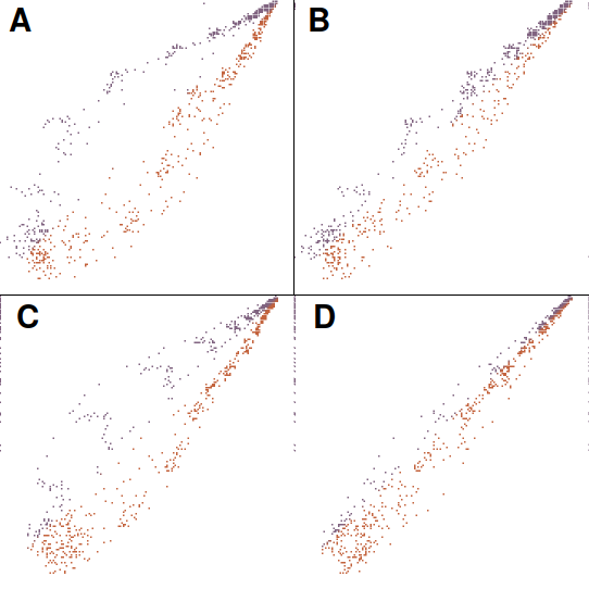
Butterfly plots
A butterfly plot gives a perfectly straight diagonal line when a band is plotted against itself (not shown). However, it is seriously, perhaps fatally flawed: the shape and relative positions of the bands have a strong influence in the result. In the graph above, small changes in relative position of the bands dramatically change the butterfly appearance. Panel A shows a plot of different bands (6 and 7), while B shows that shifting band 7 two pixels to the left and one pixel down gives a different result. Panel C shows a plot of an unchanged band 6 compared with a manipulated version in which band 6 was flipped and contrast-modified. This manipulation, said to be a common one, completely escapes detection in a butterfly plot. Panel D shows that moving the manipulated image right by two pixels and up by one drastically changes the result. It is clear that, while a butterfly plot can detect when the two bands are perfectly identical, it cannot reliably distinguish unmanipulated bands from manipulated ones. Any statistical analysis applied to the butterfly plot would therefore be meaningless.

Scheme for density profile plot
Density profile difference plots
Another simple technique is to plot the sum of pixel values in each vertical column against the x-axis position, much as is done in densitometry (though without the complicated math more advanced software uses) as shown at right. Then we subtract the two profiles to determine how much they differ. This gives a graph like the one below.
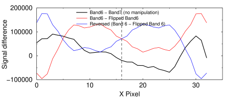
Density profile analysis of an unmanipulated blot image. This graph shows that the amount of variation between two different bands does not change if the band is flipped, which is strong evidence that if flipping occurred, it did not make the bands more similar.
Suppose we suspected that band 7 in the blot above was a duplicated or flipped version of band 6. If it was, the appropriate density profile difference plot would reveal it. For instance, if flipping had been done, the black curve in the graph at right would be identical to the red one. If the curves were identical, it would prove that the bands are identical. The advantage of this method is that it is insensitive to any contrast changes the miscreant applies.
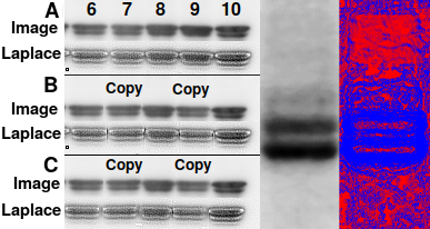
Left: Detection of edge artifacts in a Western blot. This is an
unpublished blot imaged by the author at his residence on personally owned
equipment.
A Unmanipulated image.
B Simulation of two bands flipped and copied, showing edge artifacts
made visible by 3×3 Laplace convolution filtering.
C Low-pass filtering does not hide edge artifacts and creates
areas of unnatural smoothness.
Right: Smoothness detection in Imal finds a rectangular area (red)
that has been artificially low-pass filtered, undetectable by the eye
Contrast detection
No matter how carefully a miscreant copies a band, moving pixels around produces an abrupt change in contrast at the edge of wherever they were pasted. Some types of contrast enhancement can identify these, even when they are invisible to the eye. One tactic that occasionally works is to apply a zebra-style colormap to the entire blot. Another is to apply a Laplace image convolution filter, which enhances edges.
In panel A at right, filtering the original just makes the image grainy. In panel B, where some miscreant copied a flipped copy of band 6 to position 7 and 9, the filter shows vertical lines next to the band. Even in panel C, where he or she tried to cover his or her tracks by low-pass filtering, the edges are still visible. Even a non-rectangular area copy shows up clearly. To avoid detection, the person would have to use elaborate edge feathering.
Smoothness detection, where local variations in smoothness are shown as red or blue coloration, is another technique that's easy to implement in software.
Example
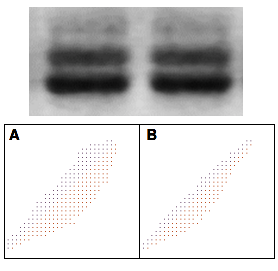
At first glance, these two adjacent lanes in this Western blot appear to be flipped copies of the other four. The butterfly plot shows that the two bands are not. A: Band 1 vs Band 2. B: Band 1 vs Band 2 flipped. If the two bands were identical, one of these plots would be a solid straight line.
At first glance, the two adjacent lanes in the Western blot shown at right pulled from the scientific literature appear to be flipped copies of each other. A histogram analysis doesn't help: due to the loss of dynamic range in the publication process, there were not enough discrete gray levels to analyze the image properly. However, the butterfly plot below tells us that the two bands are not flipped copies of each other.
Edge detection filtering of an entire eight-lane blot using Laplace and a variety of conventional edge detection kernels from 3×3 to 15×15 (not shown) showed no traces of manipulation. Smoothness detection also failed to show any evidence of regional smoothing or sharpening that would be needed to conceal image tampering.
A density profile difference plot was even more informative. To ensure that there was no effect of any contrast adjustment, I scaled the signals to give the same sum before subtracting them. The graph shows the following:
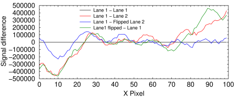
Density profile difference plot of various bands in the above image. The total signal in each column ranged from 2.6×10⁶ to 5.0×10⁶. Therefore the differences range from −11 to +9.2% of the total.
Black curve (control): Lane 1 vs. Lane 1 shows a horizontal straight line, as expected.
Red curve: Lane 1 and Lane 2 clearly have different profiles.
Blue curve: Lane 1 differs from horizontally flipped Lane 2 by −6.1 to + 5.4%.
Green curve (control): Lane 1 differs from itself when flipped by −13.2 to +11.7%, or approximately twice as much as the blue curve.
I conclude there is no evidence of manipulation in this image.
Of course, we can't rule out the possibility that the student was some sort of genius at creating falsified documents who should forget about science and get a job at the CIA. And it goes without saying that there are much easier ways to get an incorrect result in an experiment, both on purpose and accidentally, than by firing up Photoshop and falsifying an image. Internet hackers cannot, even in principle, detect these. The use of unvalidated or crudely validated image analysis techniques to detect fraud is like a drunk looking for his keys under the streetlamp because the light is better there.
Conclusions So-called internet sleuths must be held to the same standards of rigor as the scientists whose work they are discrediting.Universities need to fight back aggressively rather than simply cave to avoid bad publicity. They should hire a professional to determine whether the accusations have merit, and sue for defamation if they don't.
We need better algorithms with higher accuracy and lower false detection rates. The Recod.ai Scientific Image Integrity Dataset, which provides benchmarks for testing, is a good start.
We also need Internet browsers, PDF creation software, and word processors to handle and display 16-bit grayscale images instead of converting everything down to eight bits per pixel.
Even with sophisticated automated methods, there is still massive selection bias in deciding which images to test (since lanes that look different won't be analyzed). Thus, the hackers are like those Internet sleuths who comb through thousands of NASA Mars Lander images to find rocks that look like animals or human faces. They then apply filters and color coding only to those images, and not the thousands of other rock pictures, to trick people into thinking they're real.
Granted, this is only one blot, but the low accuracy and high false detection rate of the methods used raise questions about other cases of alleged manipulation. “Internet sleuths” must be held to the same standards of rigor as the scientists whose work they are discrediting, and universities need to fight back aggressively rather than simply cave to avoid bad publicity. Nature complains about lawsuits, but even if the university clears a researcher of wrongdoing, the accused researcher has clearly been harmed. Colleagues will decline collaborations, grant applications will be rejected, costing the university millions of dollars, and decades of careful work may have to be repeated. In comparison, suing the journal and the sleuth for defamation seems like a moderate response. Having the accuser face a fair share of the risk will help prevent the occurrence of meritless accusations, which would inevitably result in more politicization and distrust of science.
Perhaps the worst aspect is that it puts our most skilled technicians, who take justifiable pride in being able to produce perfect blots every time, at greatest risk. It wouldn't take much to convince them that working in a lab is not worth the risk. Indeed, the risk-benefit ratio to scientists of publishing any results at all is rapidly approaching 1.0: if they share their results, they run the risk of a career-damaging false accusation; if they don't, they run the risk of being accused of low productivity.
The only solution is to practice defensive science. Researchers will have to become experts in image analysis and allocate funds to hire image forensic teams on their own to protect themselves against defamatory claims. After communicating a second time with the researcher whose blot was analyzed above, I learned that this is exactly what they are doing.
There is now a big market for software that researchers can use to proactively test their images against. Proofig, ImageTwin, and OSI-endorsed PhotoShop plug-ins are a few. Unfortunately, the function of these programs is not transparent. Most of them are services that require images to be uploaded to a remote server that may become unavailable or may use them for unknown purposes. There is no standard metric by which the accuracy of these programs can be judged. Indeed, their claims to use “artificial intelligence” make all of them sound like scams.
Standardized software may help researchers to document that they tested their images for artifacts. Ultimately, however, it will be necessary for scientists to become experts in image analysis. To minimize the risk of a false accusation, they will also be forced to avoid sharing data, get rid of their students, and avoid collaborating with anyone unless they can be certain that they have no enemies and that they will never misplace a data file. Good luck finding anyone like that in academia.
[1]. Cardenuto JP, Rocha A. Benchmarking Scientific Image Forgery Detectors. Sci Eng Ethics. 2022 Aug 9;28(4):35. doi: 10.1007/s11948-022-00391-4. PMID: 35943614
aug 15 2022, 4:58 am. last updated aug 20 2022, 6:20 pm
