
Plotting Bar Graphs in Xmgrace
Xmgr and xmgrace are two Linux programs that are widely used for creating scientific and technical graphs. While xmgr is much easier to use, and draws point-to-point graphs well, its support for bar graphs is rudimentary. In contrast, xmgrace handles bar graphs better, but its menu system is perverse, which makes it quite difficult to use.

Proof that it is possible.
This article describes how to create a bar graph with error bars in xmgrace, and set each bar to a different fill pattern. In xmgrace, this can only be done by loading each data point separately through a procedure that is non-intuitive, to say the least. I wrote this page to avoid having to figure out the arcane procedure for doing this every time.
Importing data
In this simple example, we will have seven bars. Each bar needs three numbers: an x value, a y value, and an error bar value.
- Create data file in one long row, for example:
    1  10.1  0.27     2  1.36  0.49      3  0.42  0.08  \
    4  0.43  0.24     5  0.66  0.22      6  0.11  0.41   \
    7  6.6   2.01
That is, the first bar is 10.1 plus/minus 0.27, and the bars are to be evenly spaced at 1 unit intervals.
Although it's broken up here into three lines to fit on my web page, the data should be a single row of numbers in groups of three: x, y, and dy. If you want to bunch some of the bars together, leave larger intervals between some of the x values. - Don't open the data file yet. The graph type must be set to
"XY chart" before reading the file, otherwise you will be prevented
from plotting it as a bar graph.
- Plot | Graph Appearance
- Set Presentation Type XY Chart
- Apply
- Close
- Import the first data point from the data file.
- Data | Import | ASCII
- Select filename.
- Load as "block data". (Alternatively, you could load the file as "Single set". This would also create a bar graph, but all the bars would be the same color and pattern. In this case, you should put the data in a conventional format, with the x's, y's, and dy's in three separate columns. However, a bar graph in which all the bars look exactly alike is usually not very useful).
- The Edit Block Data dialog will open.
- Set type = BARDY
- Select columns 1, 2, and 3 for x, y, and y1 for graph number G0.
- If the graph isn't drawn automatically, click on ^$ to draw the graph. If you still don't see a graph, try setting the xmin and ymin to negative numbers. Sometimes xmgrace puts bars in the wrong place, such as at x=-1.
Load the remaining data points
- To load the next bar, you can't just import the next three columns.
You have to define another graph that will be superimposed on the
first graph.
- Edit | Arrange Graphs
- Matrix ... Rows = Change to 7
- Check "Add graphs as needed to fill the matrix"
- Apply
- Set the type of each graph to "XY Chart"
- Plot | Graph Appearance
- Click on the next graph (G1) in the listbox.
- Set presentation type = XY Chart
- Apply
- Click on the next graph (G2) in the listbox. Repeat with all the remaining graphs.
- Close
- Import the remaining data as before
- Data | Import | ASCII
- Load as Block Data
- Select columns 4,5,6 for graph G1
- Repeat for remaining graphs, using the same dialog box, using the appropriate columns for the x, y, and dy for each data point.
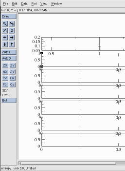
- Now there should be 7 short graphs lined up vertically as shown
in the image below.
Next we will rescale them so they all are exactly the same size and scale.- Plot | Axis Properties
- Uncheck "Display tick labels", Display axis bar", and "Display tick marks" for all but the first graph (G0).
- Edit Y Axis
- Start 0 Stop 20. This sets the scale.
- Select "Apply to all axes, all graphs" or "Apply to current axis, all graphs".
- Repeat with X axis
- Plot | Graph Appearance
- Click on G0 in the Graph list
- Set Viewport Xmin = 0.15, Xmax = 1
- Set Viewport Ymin = 0.15, Ymax = 0.85
- Repeat for all the other graphs G1 to G6.
Put all the bars together
Now you should have 7 weird looking bars on a single graph. There should not be any overlapping tick labels or tick marks. The next step is to align the bars. Remember, there are still seven graphs superimposed on the screen. Before the properties of a bar can be changed, it is necessary to change the focus to its corresponding graph.
- Make the bars bigger, one at a time.
- Plot | Set appearance
- Select set: Click on G0
- Main Tab
- Symbol properties: Type = None, Size = 301. This will make the first bar wider.
- Note that clicking on the graph list in the Set Appearance dialog has no effect. Xmgr used to have a separate option called "Set focus". This is missing in xmgrace; however, it is still possible to set the focus to the desired graph. To change the focus, keep the Set Appearance dialog open, and open the Plot | Graph Appearance dialog. Double-click in the Graph Appearance list on the desired graph. This will cause the set in the Set Appearance dialog to change.
- Repeat with G1 to G6 to make all the bars wider.
- Change the colors and fill patterns for each bar.
- Keep the Graph Appearance dialog open so you can select a graph.
- Open Plot | Set Appearance
- Click Symbols tab
- Select pattern in Symbol Fill Pattern popup menu.
Miscellaneous actions
- Changing frame line thickness
- Plot | Axis Properties
- Axis Label and Bar
- Bar propertie
- Width 2
- Select "Apply to all axes, all graphs"
- Apply
- Changing tick mark line thickness
- Plot | Axis Properties
- Tick marks
- Changing tick label fonts
- Plot | Axis Properties
- "Main" tab
- Tick label properties (near bottom)
- Font popup menu
- To get rid of tick labels on X axis
- Plot | Axis Properties
- "Main" tab
- Edit: Alt X axis
- Display Options: uncheck "Display tick labels" and Display tick marks:
- Apply to: Current axis, all graphs
- Apply
- To add labels
- Window | Drawing Objects
- Text props ...
- Click "Text"
- Click on graph where you want to type.
- Instead of text being printed on the graph as one might expect, a dialog box will pop up.
- Click on the small text window labeled "String" in the dialog box and type your label.
- Some of the escape codes work as in xmgr. For example \S = superscript, \s = subscript, \N = normal.
- Click "Apply" to put the label at the spot where you originally clicked.
- To put Greek letters on the graph
- Window | Drawing Objects | Text
- Click on graph where you want to type. The "Edit string" dialog box will pop up.
- Set Font to Symbol if all the letters are to be Greek.
- For mixed Greek and other fonts, use \f{Symbol}. For example, abc\f{Symbol}abc will print "abc" followed by the greek letters alpha, beta, and gamma. To change back to Times-Roman or Helvetica inside a string, type \f{Times} or \f{Helvetica}.
- To add new fonts
- Edit /usr/local/grace/fonts/FontDataBase and add a new line for
each new font. Increase the number on the first line to equal
the number of lines in the database file. For example:
Greek Greek omsegr.pfb
- Obtain a .pfb file from somewhere and copy it to the /usr/local/grace/fonts/type1 directory.
- Next time you start xmgrace, the new font will be present and functional.
- Edit /usr/local/grace/fonts/FontDataBase and add a new line for
each new font. Increase the number on the first line to equal
the number of lines in the database file. For example:
Problems
1. Sometimes a dialog box gets stuck, and you can't type anything in its text box or select any menu items. If this happens, use the mouse to drag the dialog box a few pixels to a new location. This is not an xmgrace problem, but is a bug in Motif and occurs with many Motif applications, including Netscape.
2. As with xmgr, only a few primary colors are available. To create a new color, it's necessary to edit the PostScript output. Look for "setgray" or "setrgbcolor".
3. The printed output in xmgrace defaults to thick line widths. This is useful if you intend to photograph your plot or for publication, but for analyzing data thin lines are often better. I had to create a script named "fixgrace" that automatically resets all the lines to zero width:
   cat $1 | sed s/linewidth.1../"linewidth 0"/g > $1.a
   cat $1.a | sed s/"size 792, 612"/"size 756, 584"/g > $1.fixed
4. It is also difficult to control the positioning of the graph on the page. Luckily, the PostScript output is conveniently organized, which makes it easy to edit the PostScript to get the graph positioned correctly. Look for lines like
337 1075 translate
and
0.24 0.24 scale
5. Although the nonlinear curve fitting gave the calculated parameters, in my tests I had trouble getting it to give an estimate of the error. Upon inspection of the source code, I found that the error is not printed if any of the data points is zero.