 uppose you woke up one day and decided to look at the statistical correlation
between two utterly insignificant variables—oh, say, sex inequality and
fertility rates in different countries. You'd get a graph something like
Fig. 1.

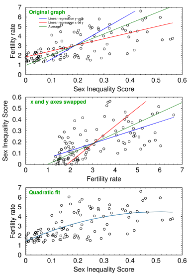
Fig. 1 Sex inequality vs fertility rate in 107 countries
The correlation is highly significant, around p=1.8×10⁻¹³. This is something that's been known for decades, but nobody knows why. If women are discriminated against we get overpopulation, and people starve. If they get equality they stop reproducing, and the country goes into a demographic death spiral.
I have no particular interest in the subject matter—it was just some real-world data to check my statistics program—but it would be nice if we could discuss such things. As Confucius said, if we can't call things by their proper names, we'll never solve the problem.
Well, it's a taboo. Taboos are problems that we dare not discuss because doing so threatens somebody's power. It follows that the fraction of ideas that are taboo is constant across societies.
On the other hand, this graph will come in mighty handy the next time some feminist spouts off about how all the world's problems are caused by men. Explain this then, lady!
Linear regression almost always gives the wrong answer
But right away we find another, far more interesting and important issue: linear regression, the standard tool that everybody has used for 200 years, only gives an accurate estimate of the slope when the correlation is perfect. Unfortunately, in the real world, the correlation is never perfect, which means that linear regression almost always gives the wrong answer.
In the top panel of Fig. 1 it's clear that the blue line, where we correlate y vs x, is incorrect. It misses the bunched up points on the left and most of the scattered points on the right. What's more, it passes through zero! Okay, maybe use the red line, which is the result of recalculating the same data points as x vs y and algebraically inverting the fitted parameters back to y vs x. But when we flip the axes (center panel), we see that the red line is even worse.

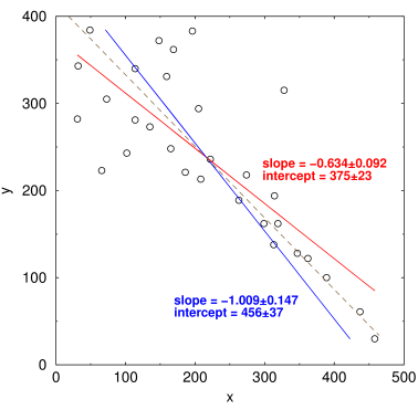
Fig. 2 Correlating x vs y and y vs x gives different results
If x and y are correlated, you'd think those two lines would be the same, but in the real world they're not. This isn't caused by a bad program or by numerical underflow in the computer: every implementation of least squares, including Levenberg-Marquardt nonlinear curve fitting, gives exactly the same incorrect result.
It makes a big difference. The blue line in Fig. 1 predicts that when sexual inequality goes to zero, the fertility rate also goes to zero, meaning the population goes extinct in one generation. The red one predicts only a gradual decline (1.8, almost 2.1, which is stable). Inspection of the graph, however, shows that fertility rates bottom out around 1.0, where the population drops by 50% every 20 years or so. Both regression lines are wrong.
Averaging them gives the green curve, which has a y-intercept of fertility rate = 0.965 at x=0 (top panel). A quadratic curve (bottom panel, Fig. 1) only increases the correlation coefficient from 0.64 to 0.66, not enough to justify the extra parameter. It gives us a y-intercept of 1.437 births per female when sex inequality goes to zero.
What's happening is that we're implicitly deciding which is the dependent variable and which is independent. In other words, we're assuming that one is the cause and the other is the effect. In most cases, we don't actually know this for sure, and it introduces bias in the result.
Of course, this isn't exactly breaking news to statisticians. Giloni and Padberg[1] wrote a great review of why that is, and propose some alternatives like l1 regression, aka least absolute deviation (LAD), least absolute residual (LAR), and many other names. The solution is to minimize something else, like the absolute residuals, instead of the squared ones. Unfortunately, it's not so easy: these algorithms can't be mathematically differentiated, so you have to use numerical techniques like linear programming to get the answer. It gets complicated, and you end up in the swampland of messy non-parametric statistics.
The solution
So I'm thinking about using a much simpler trick. In Fig. 2 above, the red line shows the least-square fit calculated as y vs x, and the blue line shows x vs y from exactly the same data points. (I back-calculated the parameters to put both lines in the form y = mx+b.) Both lines are clearly a swing and a miss, but oddly enough if you average the parameters (shown in the brown dashed line) it looks like a pretty good fit.
Now, I'm far too lazy to do any theoretical calculations to prove this. But I'm throwing the idea of dependence-agnostic regression out there for some statistician to comment on. Once that problem is solved, solving those other problems, like world peace, should be a mere detail.
1. Giloni A, Padberg M (2002). Alternative methods of linear regression. Mathematical and Computer Modeling 35, 361–374.
nov 10, 2017, 5:25 am. Updated nov 20, 2017, 4:54 am
