Is Global Warming Over?
 o I was sitting around last Saturday playing with the new global warming data to see
what all the fuss is about, what with the new consensus about global warming being over
and all, and I discovered something very odd. If you take NOAA's
Monthly Global Land and Ocean Anomalies Index and plot it against
the NOAA
ESRL Mauna Loa carbon dioxide data, you find that when CO2 increases
by less than 1.2 ppm per year, it causes global cooling!

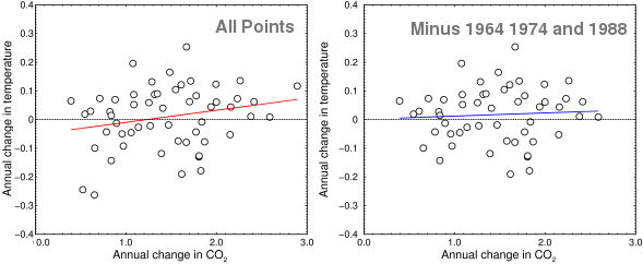
Annual change in CO2 vs. annual change in temperature
Now that cooling is almost certainly just a statistical artifact, but take a look at the left-hand graph above. It was made by binning the seasonally-corrected monthly data (which, for Mauna Loa, only goes from 1958 to 2013) into yearly averages, and plotting the time derivative of the CO2 against the time derivative of the temperature. If CO2 caused an increase in temperature, you should see a perfect straight line (or maybe an upward-pointing curve, depending on how the climate sensitivity works). In fact, you see mostly noise. Here is a statistical analysis:
| Statistical parameter | All points | Minus 1964, 1974, and 1988 |
|---|---|---|
| Correlation coefficient | 0.228 | 0.062 |
| Slope ± SE | 0.042 ± 0.024 | 0.011 ± 0.025 |
| t-value for slope | 1.709 | 0.438 |
I am just showing the most important statistical results here, but you can go crazy with this stuff. The level of noise in this plot is very high, but what the “All Points” graph above shows is that when the CO2 increases by more than 1.2 parts per million per year, the temperature goes up a little, and when it goes up by less than that the temperature goes down a little. Sometimes.
Now, as I said, the correlation above is probably just a statistical artifact. To show this, let's remove the two cold points and the one high point (1964, 1974, and 1988). With those three points gone, the cooling goes away, but the slope is also cut by 3.8-fold, from 0.042 ± 0.024 down to 0.011 ± 0.025. This is shown in the graph on the right, with a blue curve. A rule of thumb in statistics is when the error term is bigger than the number, it is hopeless to try to save the data. When the three anomalous years are removed, that's what happens. With so much instability, it is very hard to see any correlation between these two variables.
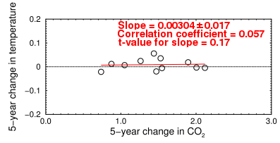
Taking a longer time average makes the graph look nicer, but it shows fairly conclusively that, in the longer term, the rate of temperature change does not correlate with the rate of changes in CO2:

Change in CO2 vs change in temperature, 1958-2012 in five-year periods
The slope is now 13.8-fold lower. In this graph, the points were binned into five-year periods, but not smoothed. Smoothing the data, such as by doing a moving average or a Gaussian smoothing, would invalidate a regression analysis of a time series like this because it would create data points that are not real. Smoothing assumes there is a trend, which is what we're trying to prove. If the sequence is actually a “random walk” (which is a viable alternative for the global warming hypothesis), smoothing it imposes order that is not really there. That's why trend watchers (so-called ‘technical analysts’) always eventually lose in the stock market.
If CO2 were causing the warming, the change in CO2 would correlate with the amount of warming.The point is that these are the sort of data the warmers wanted to use as a basis for radically changing how we live. To reduce carbon dioxide to preindustrial levels would have been nearly impossible. Even to make a measurable change in the rate of increase, we would essentially have had to abandon all our current industrial technology. All based on a trend that was so unstable that it's hard to distinguish it from a random walk.
We're all used to seeing GW presented in the newspapers as a temperature change, but nobody should care about a temperature change by itself. What's important is how much, if any, of the ΔT is caused by ΔCO2. That means we have to correlate the two variables. A simple warming or cooling curve is easy to understand, but if you can't relate annual variations in T to annual variations in actual CO2, you have nothing and you have to fall back on a computer model. No matter how sophisticated it is, a model is hardly better than a wild guess until it's confirmed by some data. As The Economist recently admitted, that's not happening.
If you can't correlate the two variables using a single data set, you have to include proxies like tree ring data. That's where people got into trouble. Thermodynamics dictates that if the two variables are causally linked, they should correlate with each other even over times as short as a decade. But they don't.

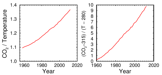
Ratio of CO2 to temperature, 1958-2012
The curves above show that CO2 is increasing much faster than the warming. Unfortunately, although they're much less noisy, they tell us little about whether there is a causal relationship. They're consistent with the well-known fact that an exponential increase in CO2 is needed to produce a linear increase in temperature. But they're also consistent with the possibility that we may be looking at two unrelated, or nearly unrelated, variables, one of which changes more than the other.
Okay, so maybe the temperature increase occurs after a delay. Or maybe, as some have suggested, it works in reverse: maybe a temperature increase causes CO2 to degas out of solution, maybe after a five-year delay. I never liked that theory either, even though my own humble calculations show it can account for at least half the observed correlation. Here are the results for time-shifting the data:
| Δ year Temperature | Correlation coefficient | Slope |
|---|---|---|
| −10 | +0.142 | +0.0288 ± 0.0305 |
| −5 | −0.207 | −0.0400 ± 0.0273 |
| −2 | +0.027 | +0.0050 ± 0.0261 |
| −1 | −0.281 | −0.0524 ± 0.0248 |
| 0 | +0.228 | +0.0420 ± 0.0244 |
| +1 | +0.382 | +0.0706 ± 0.0236 |
| +2 | −0.120 | −0.0221 ± 0.0256 |
| +5 | +0.129 | +0.0243 ± 0.0270 |
| +10 | −0.033 | −0.0071 ± 0.0324 |

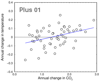
Change in CO2 vs. change in temperature in the previous year
The plus01 data set (highlighted) has the highest correlation coefficient (+0.382), so let's take a closer look at that. It looks exciting. There's still a lot of noise, but the slope is the right direction. It's true that this graph (at right) shows that the Earth should be getting cooler whenever the CO2 rises less than 1.35 parts per million per year. Like Alice in Wonderland, it looks like we would need to run our internal combustion engines faster all the time just to stay in place. From these data, if you believe that a big increase in CO2 causes warming, you also have to believe that an increase below a certain threshold—that is, an actual increase, not a decrease, just not as big—causes cooling. I don't know about you, but I would find that hard to explain. If you bin the data into five-year periods as above, you still get cooling below 1.2 ppm/year.
An even bigger problem is the time shift is in the wrong direction! The Plus01 data correlates the CO2 level with the temperature of the previous year. So if it's not a statistical artifact, it means that high temperatures cause carbon dioxide to increase when measured one year later. Maybe a more sophisticated test would find a better result, but right now my vote is that if there's a causal connection between CO2 and rising temperatures, the rising temperature really might come first, as some of the skeptics are saying. That would neatly sidestep the problem of explaining how CO2 can cause both global warming and global cooling. But it would also be bad news for us dorks who do statistical calculations on Saturday evenings. Now we will have to re-plot all our graphs the other way around.

